Introduction
Using Page Builder, you can customise the Control Panel, Customer Portal, and Web Phone. Pages help you enhance the functionality of these interfaces.
You can add Pages to multiple areas of these interfaces, such as Carrier, Customers, and Rate cards.
A page can be interactive, containing forms that can be completed and then processed by ScriptForge.
Pages work together with Button Builder to display a page on any Navigation bars.
The Elements in the Pages are extremely powerful and increase flexibility for the features you want to include in your portal.
Usage Cases
- You can use Pages to redirect to any rulebook or manuals that you want to show your customers.
For example, you can create a rulebook on how to use Script Forge with forms.
Another example may include a manual with all the information on the offered services and the corresponding payments. - Interaction with external links using Scriptforge and integration with Pages.
- You can use Pages to create interactive content. For example, getting input from the customers.
- Server-side and client-side validation.
- If you are using Webphone, the data can be collected in the form created in Pages.
- Customers may create their payment processors. They can create their interface using Pages on the website. The integration of the processing system can be done using Scriptforge.
- Number Porting: You can create a form (using Pages) on the Customer Portal and ask for details. Once the form is submitted, the requests reach Scriptforge for validation purposes. Scriptforge can update the customer on the status of their processed request.
Build Form
- Navigate to Developer Scriptforge IDE Pages and click
 to create a new form.
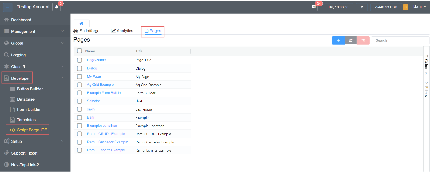
- Complete the form's Name and Title fields, then click Save.
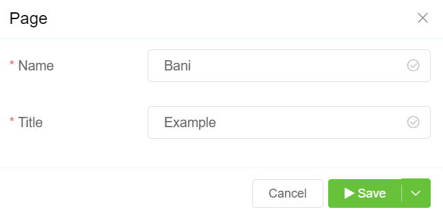
- When you see the screen with the various pages, click on the form you created (Bani in this case).
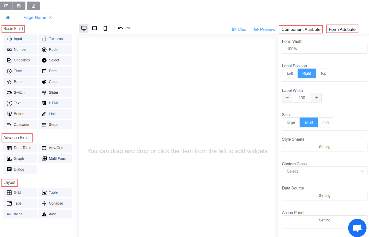
- A screen with options such as Basic Field, Advance Field, Layout, Component Attribute, and Form Attribute enables you to design attractive and interactive interfaces for your customers.
Basic Fields
Know More
Click on each Icon to find out more about each element.
| Icon | Description |
|---|---|
 |
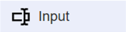
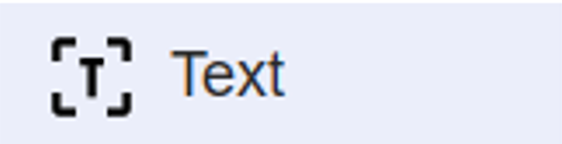
The input field allows you to enter single-line text. |
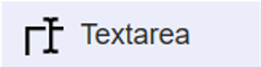 |
A textarea is useful when you want to allow users to enter a sizeable amount of free-form text, for example, a review or feedback. |
 |
The number field helps to start a counter from a minimum to a maximum value. |
 |
The radio buttons allow one option to be selected out of the multiple options. |
 |
Checkboxes are used when there are lists of options and the user may select any number of choices, including zero, one, or several. In other words, each checkbox is independent of all the other checkboxes in the list, so checking one box doesn't uncheck the others. |
 |
The select option is a drop-down list with various options; you can either select one or many options. |
 |
The time picker allows you to pick a time (hh: mm :ss). You can also select the start and end time. |
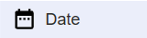 |
The date picker allows you to pick a date (yyyy-mm-dd). You can also select the start and end dates. |
 |
A rating is an evaluation or assessment of something in terms of quality, quantity, or some combination of both. Therefore, you can add this wherever you want to rate the quality of a call, cost, or latency. |
 |
The color picker allows you to change the color. |
 |
The switch allows switching between "true" and "false" values. |
 |
The slider is a control for selecting a single value from a continuous range of values. |
 |
Text displays a non-interactive piece of text to the user. Text elements can be used to provide captions or labels for other GUI controls or to display instructions or other texts. |
 |
HTML provides you with the option of writing the HTML code. |
 |
The button is responsible for performing an action when clicked, either for redirecting or for viewing purposes. |
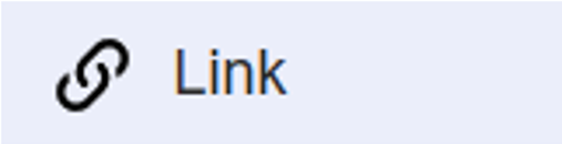 |
Link lets you add an external link to the page. When you click on the link, you will be redirected to that website, document, etc. |
 |
Cascader is a multi-level dropdown option. When a data set has a clear hierarchical structure, it can be viewed and selected through the cascading selector. |
 |
Steps can be used to show the progress of a process. For each completed step, the corresponding step number will be highlighted. |
Advance Fields
Know More
Click on each Icon to learn more about each element.
| Icon | Description |
|---|---|
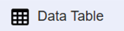 |
A Data table is a document composed of columns, rows, and cells that contain specific values. They store information that people can retrieve later and update as required. It can be used for importing or editing multiple entries. |
 |
The grid displays a grid-like layout on the various navigation bars like Customers, Carriers, etc. It is more useful for editing and displaying information on the system than feeding it information. |
 |
A graph allows you to display graphs of various parameters like ASR, RTP. |
 |
The Multi-form feature allows you to prepare multiple forms. If you want multiple duplicate copies (cloning) of the created form, you can use this advanced component. |
 |
A dialog is a small window that prompts the user to make a decision or enter additional information. A dialog does not fill the screen and is normally used for events that require users to take an action before they can proceed. |
Layout
Know More
Click on each Icon to learn more about each element.
| Icon | Description |
|---|---|
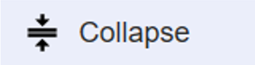 |
The collapse option allows you to make a section, or group of fields, collapsible. It is useful when there are several sections in your form and you want them to take up less vertical space. You may use collapsible or standard sections to adjust your form layout or conditionally hide or show a group of fields. |
 |
The inline feature allows you to create a reactive layout where each element occupies only the width it requires. |
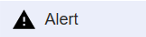 |
An alert occurs in response to an event and can potentially trigger a notification. It brings something to the user's attention and provides a way of sending a message that can be read without opening the app, e.g., a low-balance alert. |
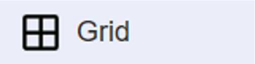 |
A grid layout provides equal size for two-dimensional layouts. |
 |
A table allows you to arrange the elements in rows and columns. The rows and columns are added dynamically as you build the table. |
 |
Adding tabs to a form can make it more organised and easier to use if the form contains many controls. You can place the related controls on separate pages of the tab. |
You can change the characteristics of each component. You can click on Component Attribute to change the properties of the elements.
Form Attribute
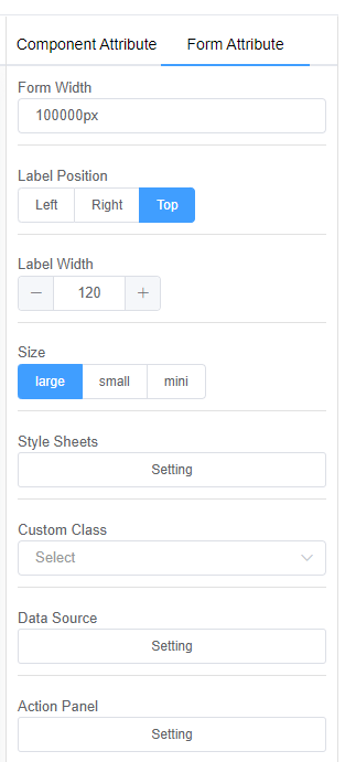
The Form attribute helps you specify values for the following parameters for all the fields in the form:
1. Form Width: Form width helps you decide the dimensions of the overall form.
2. Label Position: Label position helps you position the field labels.
You can decide between Left, Right and Top.
3. Size: Size describes the dimensions of all the fields in the form.
You can choose from Large, Small, and Mini.
4. Style sheets: You can add custom Style Sheets to make the interface look more pleasing.
5. Data Source: Data Source can be External, from Script Forge or a Database.
6. Action Panel: Action Panel allows you to specify the actions for buttons and link controls.
Preview Options
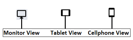
Click on the Preview button to view the form.
You can choose between the Monitor view, Tablet view, and Cellphone view.
1. Get Data: Get Data displays the raw data from the form.
2. Reset: Resetting will erase all the data filled in the form.
3. Disabled or Enabled Edit: Disabled edit will not allow you or your customer to enter data in the form; Enabled edit will allow you or your customer to enter the data in the form.
4. Print Read Mode: Print Read mode allows you to view the form before printing.
5. Print: The print option will let you print the filled form.
6. Close: Close will you exit from the preview window.
Configure Data Source
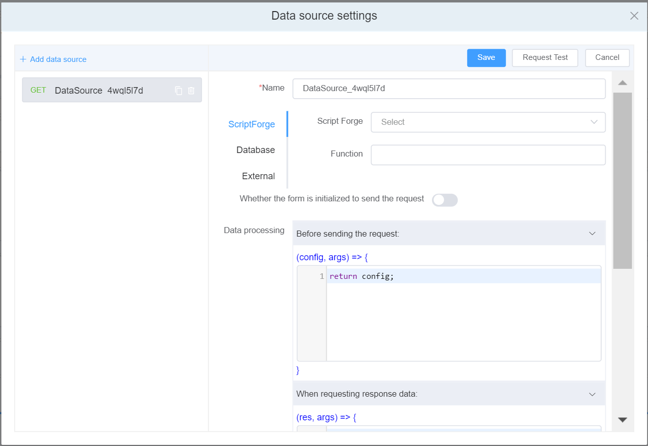
1.1. Click on the Data Source Setting.
2.2. Click on Add Data Source, and the data source setting will appear on the right-side of the panel.
3. Name**: The data source name, which must be unique, is used to display and select data sources.
4.3. You can select the Data Source from 3 options: Script Forge, External ( allows you to get data from external services to your end users.), and Database (Refer for API documentation).
4.1. External Data Source.
- When you select External database you can select from 4 HTTP requests:
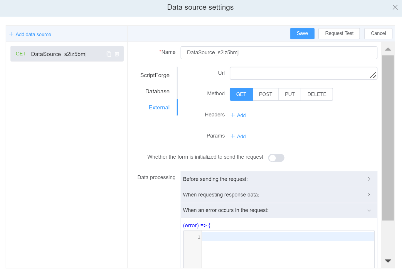
| Request Name | Description |
|---|---|
| GET | GET request is used to read/retrieve data from a web server. |
| POST | POST request is used to send data (file, form data, etc.) to the server. |
| PUT | PUT request is used to modify the data on the server. |
| DELETE | DELETE request is used to delete the data on the server at a specified location. |
-
Header:
- To send meta data
- Content Type - text/html or text/JSON
- Request authorization - authentication information
- Response caching
- Response cookies
-
Params:By using the params keyword, you can specify a method parameter that takes a variable number of arguments.
5. Whether the form is initialized to send the request**: It is an asynchronous activity that sends an HTTP request and waits for a response from the web server.
6. Data Processing**
| Data Processing Type | Description | Parameters |
|---|---|---|
| Before the request is sent | Before the request is sent, configure the parameters, headers, address and other options of the request. | 1. Modify the request address config.url = 'new request URL'. 2. Modify the request headerconfig.headers = {'X-Requested-With': 'XMLHttpRequest'}. 3. Modify request query parametersconfig.params = {ID: 12345}. 4. Request the data sent by the body, not applicable to GET requests config.data = {firstName: 'Fred'}. |
| When requesting to return response data | After the interface request is successful, the returned data can be processed. | res: The data returned by the interface can be processed here. |
| When an error occurs in the request | PUT request is used to modify the data on the server. |
7. Request Test
After completing the data source configuration, you can click Request Test to verify the data source interface to check whether the filling is successful and whether the returned data is correct.
Preview Options
Click on the Preview button to view the form.
You can choose between the Monitor view, Tablet view, and Cellphone view.
1. Get Data: Get Data displays the raw data from the form.
2. Reset: Resetting will erase all the data filled in the form.
3. Disabled or Enabled Edit: Disabled edit will not allow you or your customer to enter data in the form; Enabled edit will allow you or your customer to enter the data in the form.
4. Print Read Mode: Print Read mode allows you to view the form before printing.
5. Print: The print option will let you print the filled form.
6. Close: Close will you exit from the preview window.