Basic Field
Basic Fields include a collection of standard elements that can be used to create simple widgets for creating forms. A detailed description of all the Basic Fields are discussed below.
Input and Textarea
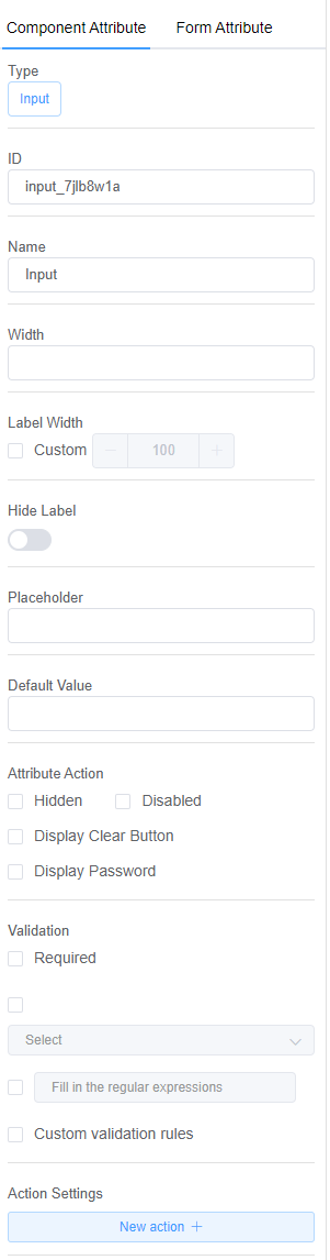
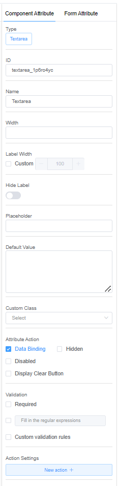
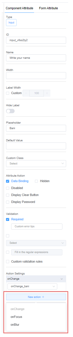
1. ID: An ID is a distinct name or number that is assigned to each INPUT component in the form.
2. Name: The name of your input field is displayed.
3. Width: Width allows you to adjust the width of the Placeholder.
4. Label Width: Label width adjusts the distance between each side of the label.
5. Hide Label: Set the input visibility when loaded.
6. Placeholder: This is the greyed-out value that is displayed when the field is empty.
7. Default Value: A placeholder with a pre-defined value.
8. Custom Class:
Currently Unused
9. Action Attribute: The action attribute specifies the action that will be taken when the form is submitted. Usually, the form data is sent to a file on the server when the user clicks on the submit button.
-
Data Binding: Data Binding is a feature that allows you to connect data from one element (the host element) to a property or attribute of another element in the form.
-
Hidden: To make the element hidden in the form.
-
Disable: When the disable option is active, the customer will not be able to enter any information in the input field.
-
Display Clear Button: The Clear button allows you to remove the values from the currently displayed object's fields.
-
Display Password: The password feature allows the customer to hide the characters of the input to avoid any outflow of sensitive data.
10. Validation: Validation helps you verify that the input entered by the customer is accurate and complete.
Validation Examples
Some fields are required to be filled in, so you can use the Required field.
Another example is if you want the answers in a specific format like e-mail, URL, String, or Hexadecimal then this field is extremely useful. (Refer for API documentation).
- Custom Validation Rules: If you want to add some JavaScript and include a callback. A callback will be performed via the callback function.
11. Action Settings: Form actions define anything that happens after a visitor clicks the form submit button. Use form actions to add a redirect URL, send a confirmation email or set up conditional actions depending on the form's questions.
Action settings specify the actions for the input element. For example, OnChange, OnBLur, etc. You can create your own customizable actions and functions by clicking on New Action +.
| Event Name | Description |
|---|---|
| onChange | When the element loses focus after the content has been changed. |
| onFocus | Focus on the input element. For example, it's called when the user clicks on a text input. |
| onBlur | Blur is used to remove focus from the input field. For example, when the user moves to another field or another page. |
Functional Overview of the Action Panel
You can write the Javascript Code in New Action + to implement your own logic for an event.
- Click on New Action + and add an action function.
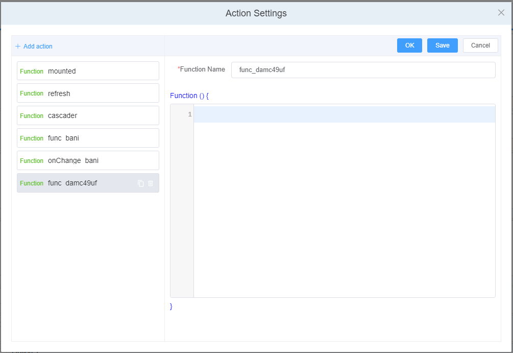
- Write your code and save it.
- Select the action function and add its functionality to your created form.
Number
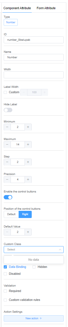
1. Minimum: Use the Minimum option to specify the smallest value for your counter.
2. Maximum: With the Maximum option, you can specify the maximum value for your counter.
3. Step: The Steps option specifies the number interval.
4. Precision: Using the precision option, you can add decimal places to the counter.
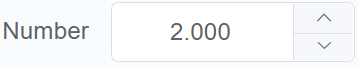
5. Enable the control buttons: The control buttons allow the customer to increase or decrease the count value.
6. Position of the control buttons:
- Default:
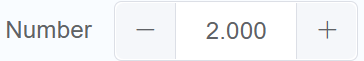
- Right:
7. Action Settings:
| Event Name | Description |
|---|---|
| onChange | Triggers when the value changes. |
| onFocus | Triggers when Input focuses. |
| onBlur | Triggers when Input blurs. |
Radio Button and Checkbox Button
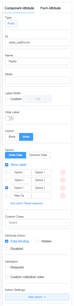
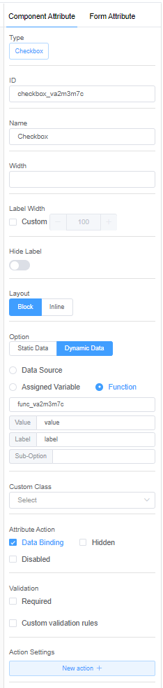
1. Layout: Layout aids in the positioning of radio buttons.
- Block: Block will place the radio buttons vertically.
- Inline: Inline will place the radio buttons horizontally.
2. Option: Option allows you to specify whether you want your options to display static or dynamic data.
The data interaction between the form and the back-end application can be realized using data sources.
For Static data, customers will only be allowed to select the displayed options that you have created.
Dynamic data makes the form reactive and interactive. The data can be populated with respect to the input values in other elements.
You can load the data in three ways: using a Data Source, Assigned Value or as a Function. (API Documentation for Data Source Actions with Examples)
3. Action Settings:
| Event Name | Description |
|---|---|
| onChange | Triggers when the checked state has been changed. |
Dynamic Data Sources
Data sources can be External, with URLs specified and data exchange methods such as GET, POST, PUT, and DELETE.
You can also use Script Forge (API Documentation for Script Forge actions) as a data source.
Another way of choosing a data source is through a Database (API Documentation for Database methods).
You can get the value of a checkbox by using the getData method, and you can set the visibility based on the hide method.
Select
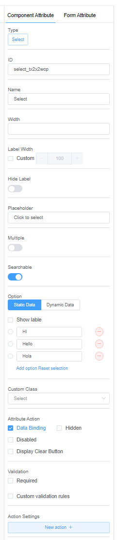
1. Multiple: When enabled, the Multiple feature allows you to select many options from a drop-down list of options.
2. Searchable: The search function allows you to quickly find options.
3. Action Settings:
| Event Name | Description |
|---|---|
| onChange | Triggers when the selected value changes. |
| onFocus | Focus on the Input component. |
| onBlur | Blur the Input component and hide the dropdown. |
Time
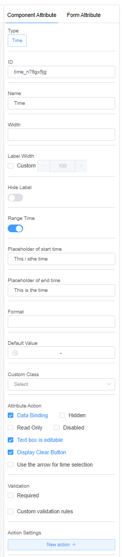
1. Range Time: With the Range Time feature, you can specify a start and end time.
2. Placeholder of Start Time: A greyed-out value for the Start Time is displayed when the field is empty.
3. Placeholder of End Time: A greyed-out value for End Time is displayed when the field is empty.
4. Format: To configure the time format
5. Default Value: The default value allows you to specify a predetermined start and end time.
6. Attribute Action:
-
Read Only: The Read-only feature allows you to view but not select the time value.
-
Text box is editable: The Edit feature allows your customers to add or delete information from the form.
7. Action Settings:
| Event Name | Description |
|---|---|
| onChange | Triggers when user the confirms the value. |
| onFocus | Focus on the Input component. |
| onBlur | Blur the Input component. |
Date
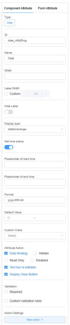
1. Display Type:
- Year: Year enables your customers to switch between years. By default, the date will be January 1.
- Month: Month enables your customers to switch between years and months. By default, the date will be January 1.
- Date: With Date, your customers can select the year, month, and date. Only a single selection is allowed.
- Dates. Multiple date selections are allowed.
- Week: Allows you to select the days of the week.
- DateTime: With the DateTime feature, your customers can choose a specific date and time.
- Datetimerange: The DateTime range feature allows your customers to specify a start and stop date, as well as a start and stop time.
2. Get Time Stamp: Enabling Time Stamp records the event's time of occurrence.
3. Action Settings:
| Event Name | Description |
|---|---|
| onChange | onChange can be executed when the selected date changes. |
| onFocus | Focus on the Input component. |
| onBlur | Blur the Input component. |
The range date and time selector can be pretty useful for selecting the dates and specific times for displaying information on the graphs.
Rate
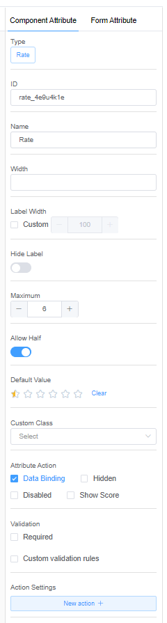
1. Maximum: Maximum allows you to enter the number of stars required for a rating.
2. Allow Half: Enabling Allow Half will let your customers make a semi-selection.
3. Default Value: The default option lets you set a minimum rating score while you create the form. Your customers will only be allowed to rate above the preset score.
4. Action Settings:
| Event Name | Description |
|---|---|
| onChange | Triggers when the rate value is changed. |
Color
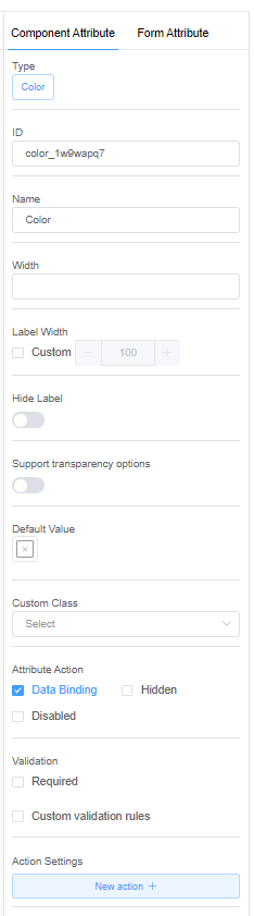
1. Support transparency options: The Transparent option lets you decide whether to keep your color transparent or opaque. You can keep the value of alpha between 0 (completely transparent) and 1 (completely opaque).
2. Default Value: You can select a default color.
3. Action Settings:
| Event Name | Description |
|---|---|
| onChange | Triggers when the color value changes. |
Switch
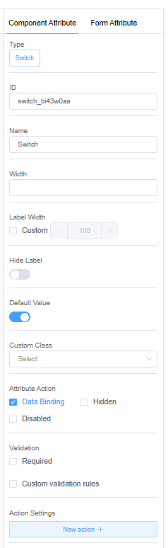
1. Default Value: You can select a default value of 'true' or 'false'.
2. Action Settings:
| Event Name | Description |
|---|---|
| onChange | Triggers when the selected state is changing. |
Slider
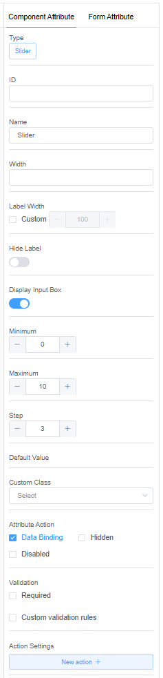
1. Display input box: The input box lets you display the value you have selected on the slider. You can also change the value of the slider by entering values into the input box or by navigating the - or + buttons.
2. Minimum: The minimum value of the slider can be set.
3. Maximum: The maximum value of the slider can be set.
4. Step: Steps allow you to select the rate at which the slider will change.
For example, if you select the step value as 2, the slider will add 2 to the existing value. The same rule is valid for a '-2' step value.
5. Action Settings:
| Event Name | Description |
|---|---|
| onChange | Triggers when the value changes (if the mouse is being dragged, this event only fires when the mouse is released). |
Text
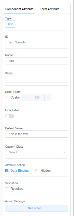
1. Default Value: You can enter a preset value you want your customers to read or follow.
2. Action Settings:
| Event Name | Description |
|---|---|
| onChange | Triggers whenever the contents of the TextBox control are changed, either by a user or programmatically. This event fires when the TextBox control is created and initially populated with text. |
HTML
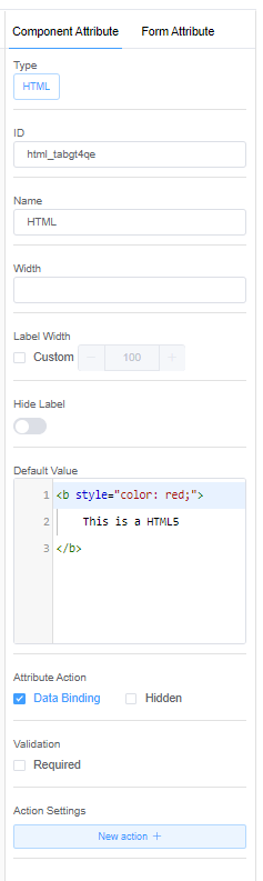
1. Default Value: The default value allows you to enter a preset HTML code.
2. Action Settings:
| Event Name | Description |
|---|---|
| onChange | Triggers when the element value changes in the HTML code. For example, "The input value has changed. The new value is: hi". |
Button
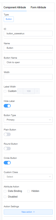
1. Button Type:
- Default: A default button indicates a series of actions without priority.
For example, "Submit" can be a default button in the forms. - Primary: The primary button indicates the main action or an important event to be performed by the customer.
- Success: The success button indicates the completion of a task.
- Warning: A warning button can be introduced when you want your customer to pay special attention to a specific condition.
- Danger: Danger can be introduced by risk-taking actions such as deletion or authorization.
- Info: Info buttons are introduced when you want to provide additional information to the customer where you think the customer might need help.
- Text / Link: Text / Link buttons are generally used when you want to redirect the customer to some other website or page.
2. Button shape: There are three button shapes to choose from: plain, round, and circular.
3. Action Settings:
| Event Name | Description |
|---|---|
| onClick | The onclick event occurs when the user clicks on the button. For example, click on the button to display the date or change the color. |
Link
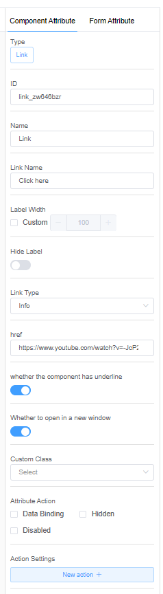
1. Link Name: The link name specifies the external link to be used in the form.
2. href: href is a hypertext reference that indicates the hyperlink's destination.
3. whether the component has underline: If the link is to be underlined.
4. whether to open in a new window: The option to open the link in a new separate window.
5. Action Settings:
| Event Name | Description |
|---|---|
| onClick | onClick event can be integrated with the Link element. The purpose is data processing. For example, before the link redirects the customer to the external website or document, it may ask the customer to fill in some details, and only then will they be allowed to go to the page. |
Cascader
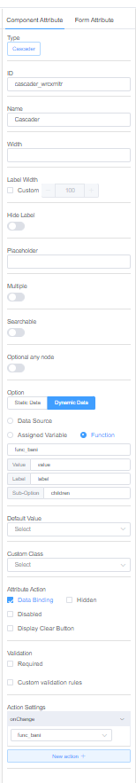
1. Optional any node: You can make the cascader's sub-options selectable.
2. Action Settings:
| Event Name | Description |
|---|---|
| onClick | Triggers when the binding value changes. For example, if the cascader has multiple streams like Science, Commerce, and the Arts, then the option in the next dropdown will change with respect to the selected stream. |
| onFocus | Focus the on Input component. |
| onBlur | Blur the Input component and hide the dropdown. |
Steps
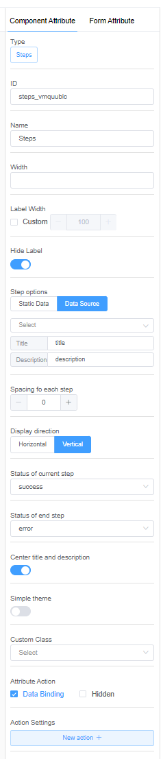
1. Spacing for each step: You can set the spacing between the steps.
2. Display direction: Steps can be displayed in either a horizontal or vertical view.
3. Current step status/end step: You can select the status of your steps from the options below.
- Wait: The form is on standby since the customer is filling in information on that page.
- Process: Some information or process is being materialized.
- Finish: Finish means that the customers have completed all of their tasks.
- Error: The error step is displayed when the system does not accept the information provided by the customer.
- Success: The success step is displayed when all the information is complete and accepted by the system.
4. Center title and description: The step's title and description will be centered.
5. Simple theme: The theme lets you decide on the layout of the step feature.
6. Action Settings:
| Event Name | Description |
|---|---|
| onChange | Triggers when the step number changes. |